
Imagine this: you’re browsing a website, searching for crucial information, but you get lost in a maze of links and pages. Isn’t that frustrating?
As a small business owner, you understand the importance of a seamless online experience. That’s where website navigation comes into play. It is the roadmap for your site.
Let’s dive deep into seven website navigation best practices to enhance user experience, ensuring your site is a digital presence that guides visitors to their destination.
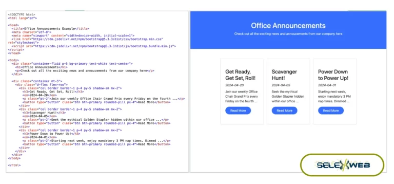
1. Keep It Simple and Intuitive
The key to a user-friendly website lies in its simplicity. Overcomplicated menus not only confuse visitors but also diminish the overall appeal of your site.
Aim for a straightforward, easy-to-follow layout that guides your users. Your primary navigation should be immediately noticeable, offering quick access to the most important sections of your website.
The logical grouping of items further enhances this simplicity. For instance, similar services or products should be categorized together to facilitate quick decision-making.
Remember, when it comes to menu options, less is more. A clutter-free, minimalist approach is one of the best website design tips you can follow. A streamlined design appeals to the eye and makes for a more efficient user experience.
2. Consistency Is Key
Consistency is a foundational principle in the realm of website design. It ensures a coherent and predictable user experience.
Strive to maintain a consistent navigation structure across all pages of your website. This particular structure includes using the same style, color scheme, and position for your menus and other navigational elements.
Such consistency aids in building a sense of familiarity among your users. When visitors know what to expect and where to find things, they’re more likely to explore your site further.
3. Utilize Clear Navigation Labels
Clear, descriptive navigation labels are crucial for guiding users through your site. They serve as signposts, directing users to the correct information.
Opt for concise and descriptive labels that reflect the content they link to. Avoid unnecessary technical jargon, flowery language, or ambiguous terms that might perplex users.
Clear labels not only enhance the overall format of your website but also aid in improving user understanding. This leads to a more enjoyable browsing experience that encourages users to engage with your content.
Remember, the goal is to make the journey through your website as effortless and intuitive as possible. Clear navigation labels are a vital component of this process.
4. Prioritize Accessibility
Website accessibility is more than a best practice. In some cases, it can be a legal and ethical obligation. It’s crucial to ensure your site is navigable for all users, including those with visual, auditory, motor, or cognitive disabilities.
To achieve this, incorporate elements such as screen reader compatibility, which allows visually impaired users to understand your site’s content through audio descriptions.
Also, ensure that your website’s color contrast ratios meet the standards for users with color vision deficiencies. This makes your site more inclusive and enhances the overall user experience. Remember, an accessible website is a user-friendly website.
5. Highlight Your Call to Action
Your website’s call to action (CTA) is pivotal in guiding visitors toward making a decision, whether purchasing, signing up for a newsletter, or contacting your business. To maximize the impact of your CTAs, consider their placement and design. For example, place them in high-traffic areas like the top of your homepage or at the end of key content sections.
Use compelling language that resonates with your target audience and creates a sense of urgency or exclusivity. Also, A/B testing different CTA designs and messages can be invaluable in understanding what resonates best with your visitors. A well-crafted CTA enhances the website format and plays a key role in converting visitors into loyal customers.
6. Test and Optimize
Be sure to engage in continuous testing and optimization. Use tools like heat maps to understand how users interact with your site and identify areas where they may experience confusion or difficulty.
Analyze user pathways to determine if visitors are navigating your site as intended or getting lost along the way. Regular updates based on user feedback and analytical data can improve navigation efficiency and overall user satisfaction.
Always review your website analytics to monitor user behavior and traffic patterns. Adjust your navigation structure based on these insights to enhance the user experience and keep your website current and effective.
7. Mobile Responsiveness
In an era where smartphones and tablets reign supreme, having a mobile-responsive website is no longer optional. Many users access the internet via mobile devices, making mobile responsiveness a critical aspect of website navigation best practices. Your website must adapt and function across various screen sizes and devices.
A mobile-responsive design ensures that your site’s layout, images, and text automatically adjust to fit the screen on which they’re displayed. This adaptability is critical to keeping your users engaged and interested.
When a site is not mobile-friendly, it can lead to distorted images, misplaced text, and a frustrating user experience, often resulting in higher bounce rates and lost potential customers.
Implementing a mobile-responsive design also contributes to better search engine rankings. Search engines give higher ranking preference to websites optimized for mobile devices in their search results. Ensuring your site is mobile-responsive is beneficial for user experience and crucial for your online visibility.
A mobile-responsive website format demonstrates to your customers that you value their convenience and are committed to providing a seamless browsing experience, regardless of their device. This level of consideration can enhance your brand’s reputation and trustworthiness.
Master Website Navigation Best Practices With SelexWeb
By implementing these website navigation best practices, you can create a user-friendly website that resonates with your target audience.
Are you ready to elevate your online presence? Don’t let website design be an afterthought.
At SelexWeb, we craft bespoke website solutions for small business owners. Our expertise in website navigation and design ensures your site is visually appealing, functional, and intuitive for your users.
Take the first step towards a user-friendly website that sets you apart from the competition. Book a discovery call with SelexWeb today, and let’s navigate the path to your digital success together.

